The glyph
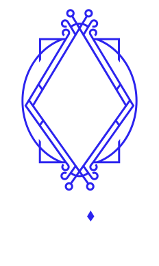
The double diamond on its own, no lettering. This is the answer when the lockup cannot reach 32px — a favicon, an avatar, the nav bar of this site.
Design system
The living design system. Every swatch below reads the same token the site and the app render with, so this page cannot drift from what ships.
All of the brand material, ready to download. If you are putting the ETH Cali mark on a poster, a talk or a sponsorship, take it from here rather than from a screenshot.
Brand kit
Every lockup, the glyph, the favicons, the social art and the web fonts, with the guide inside.
ZIP →Sarun Pro — full family
All 60 desktop fonts: Pro, Condensed and Narrow, Thin through Heavy, italics included.
ZIP →The double diamond on its own, no lettering. This is the answer when the lockup cannot reach 32px — a favicon, an avatar, the nav bar of this site.
The primary lockup, reversed. It is what this site uses in the header, the footer and its share cards, and what goes on any dark ground.
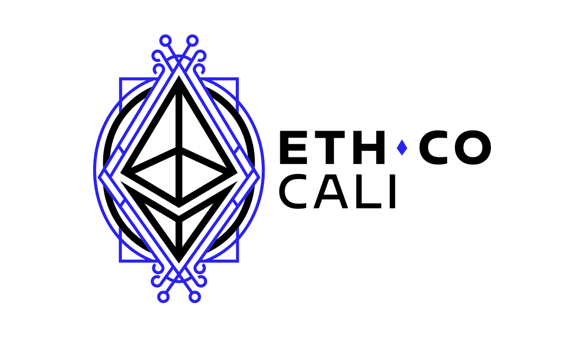
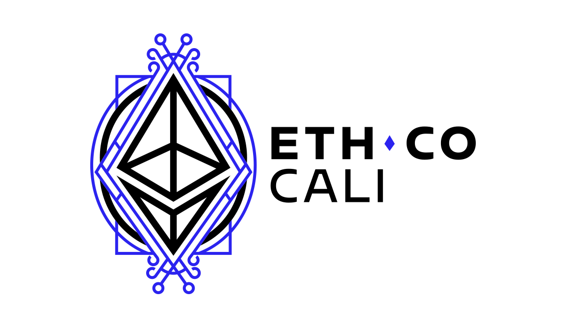
The primary lockup. Nav bars, headers and footers on a white ground. The compact version carries less air around the glyph.
For posters, merch and anywhere there is more height than width. Both grounds are here: on white and on black.
Without the filigree: just the octahedron and the arc. For small print, embroidery and screen printing, where the fine line of the glyph fills in and becomes a smudge.
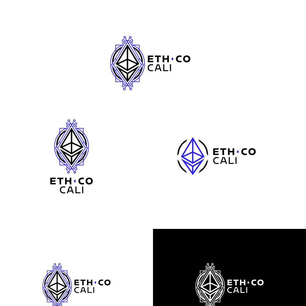
Every lockup in one vector file, scalable to any size without losing anything. If you are going to print, start here rather than from a PNG.
Square, 1280 × 1280. For the avatar on any network — almost all of them crop to a circle, and the glyph stays centred.
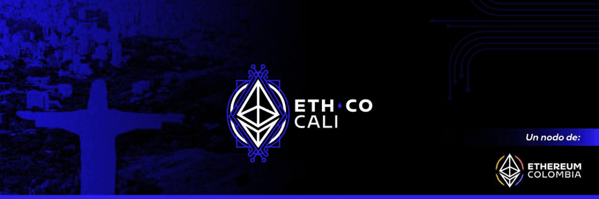
For a profile header and for a share card. The 1200 × 400 PNG is the one this site puts in og:image.
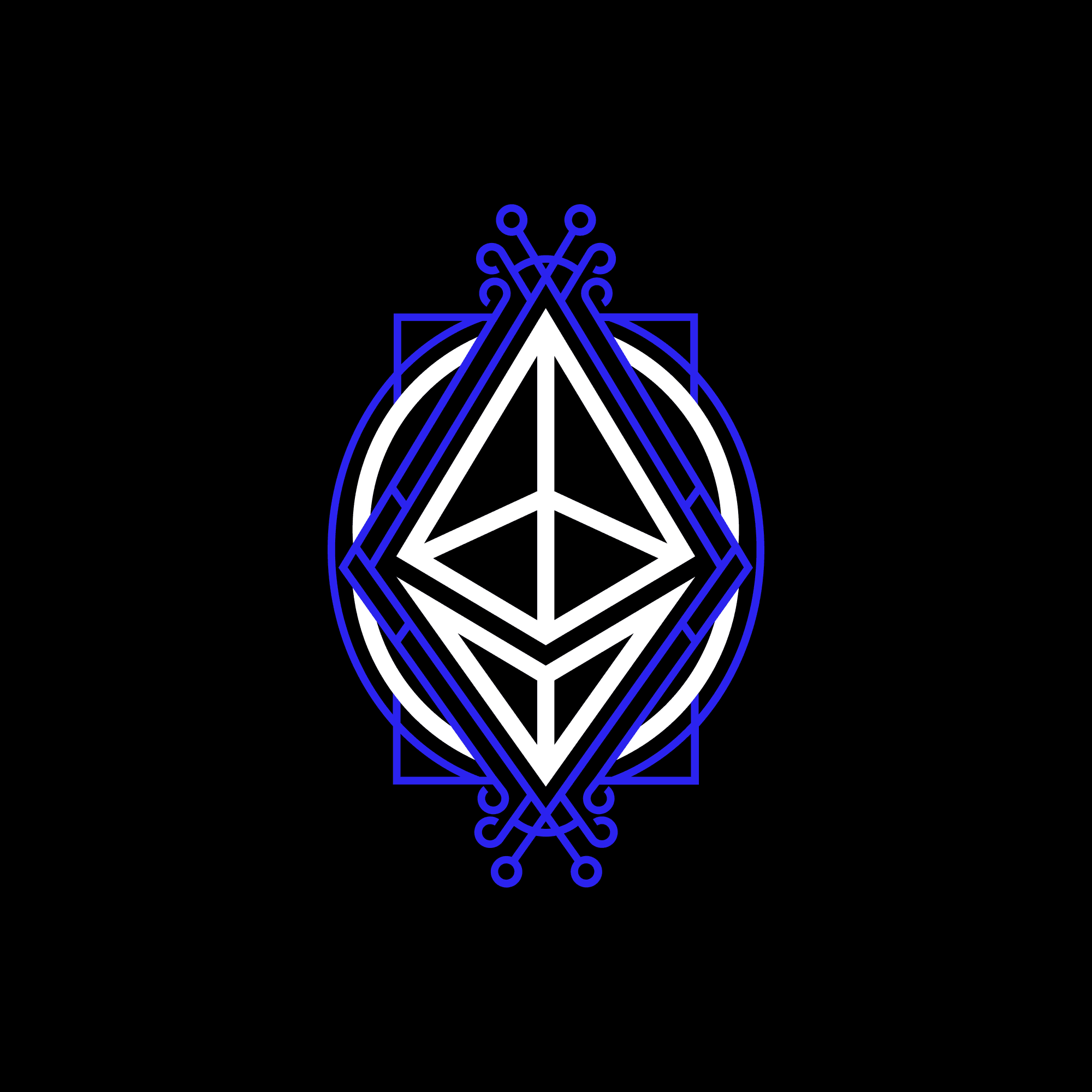
The mark is a double diamond drawn in one continuous ultramarine line — the Ethereum octahedron rebuilt as filigree ironwork. Four rules protect it.
X = the height of the diamond, on all four sides. Nothing comes inside that margin.
32px tall on screen, 10mm in print. Below that use the glyph on its own, never a shrunken lockup.
Ultramarine #2B23EF or white. Nothing else — it is the only chromatic colour in the brand, sampled from the mark.
eth-blue
eth-blue-lift
eth-blue-deep
eth-blue-text
Links and data on dark
surface-void
surface-slab
surface-inset
surface-ridge
Never decorative. Green means something succeeded on chain — if a thing is merely pleasant, it is a brand colour, not a signal.
signal-confirmed
signal-pending
signal-reverted
content-primaryThe quick brown fox jumps over the lazy dog
content-secondaryThe quick brown fox jumps over the lazy dog
content-mutedThe quick brown fox jumps over the lazy dog
content-faintThe quick brown fox jumps over the lazy dog
Sarun Pro for anything a human wrote, JetBrains Mono for anything a chain produced: addresses, hashes, amounts, dates.
Sarun Pro Black 900
Sarun Pro Bold 700
Sarun Pro Medium 500
Sarun Pro Regular 400
JetBrains Mono · 0xB6BDe4fB…6da64
Sarun Pro has no 600. It steps Medium 500 to Bold 700, so font-semibold is mapped to 700 rather than synthesised.
The five weights this site loads, in WOFF2.
Sarun Pro is a commercial typeface licensed from its foundry. It is published here for ETH Cali work and that of its partner communities; for anything else, licence it yourself. JetBrains Mono is free and Apache 2.0 licensed. We do not redistribute it — it loads from Google Fonts.